Pantone Color of the Year 2021: Guide to Ultimate Grey & Illuminating Yellow
What Is the Meaning Behind Ultimate Grey & Illuminating?
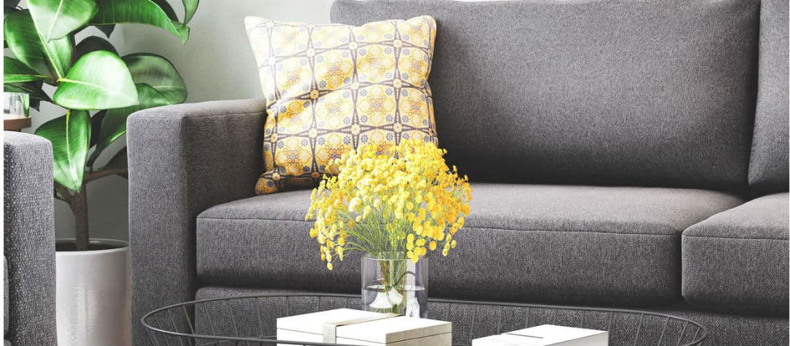
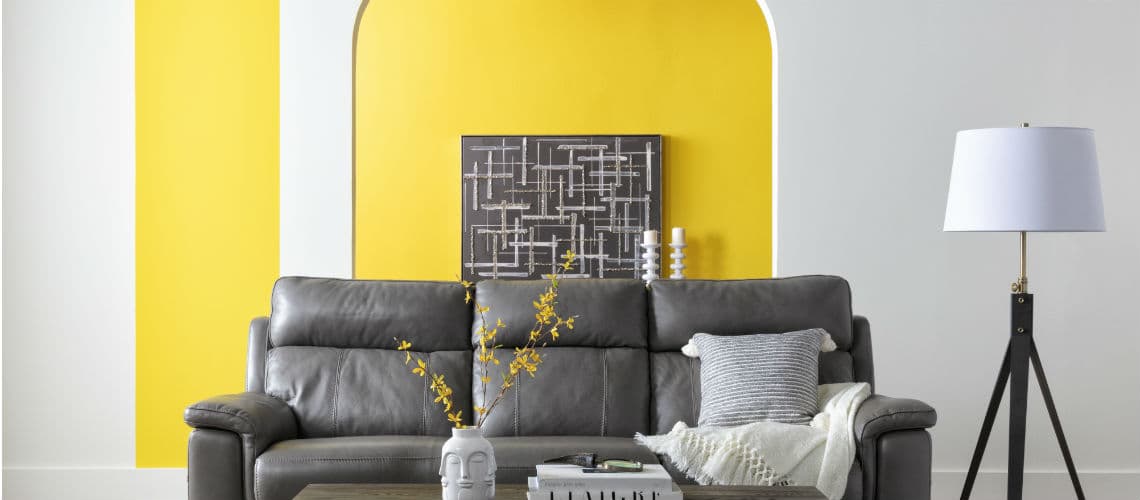
Ultimate Grey and Illuminating Yellow: this year, Pantone chose two colors. The grey and yellow combination is, according to the Pantone website, “practical and rock solid but at the same time warming and optimistic.” It’s a mood that seems fitting after a tumultuous year – and a positive reinforcement for 2021.
Of course, Pantone’s announcement isn’t just meant to be read about. As 2020 closes and the hope for a better 2021 draws near, Ultimate Grey and Illuminating ache to be incorporated into everyday life. Through our top picks for home decorating essentials below, we show you how to do just that.
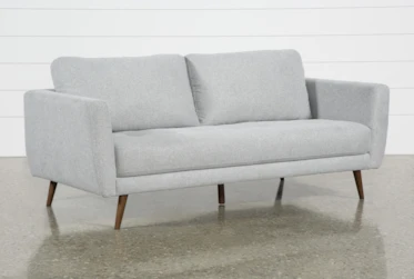
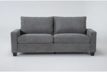
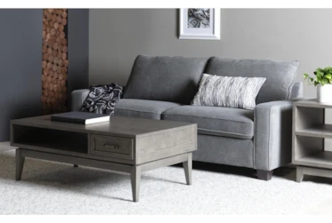
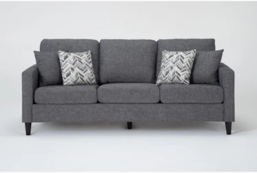
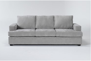
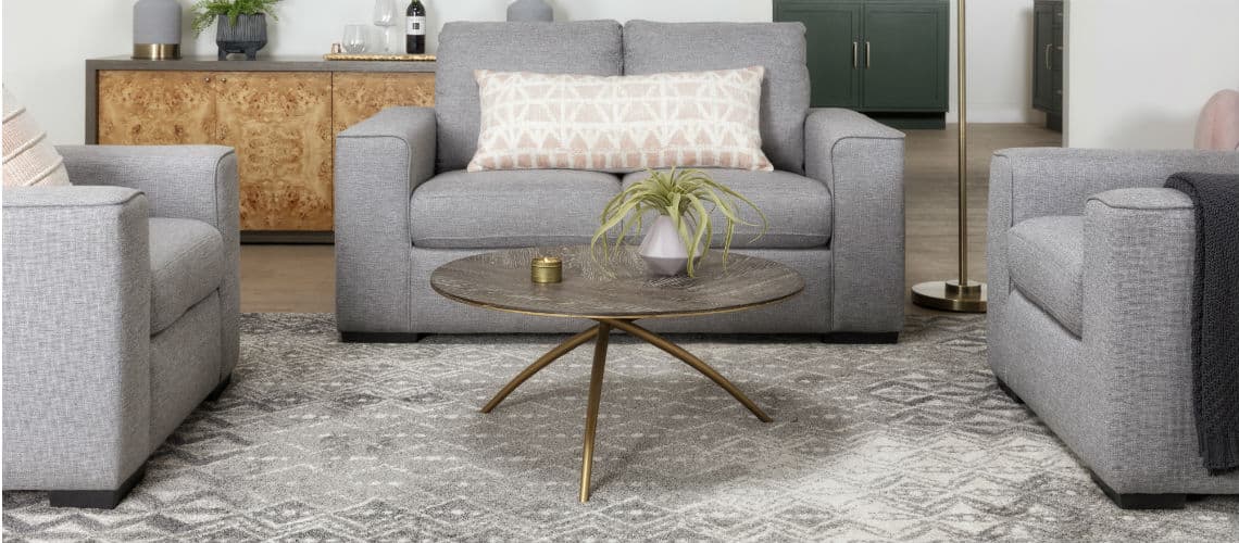
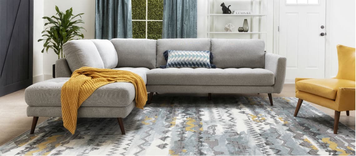
Pantone 2021 Decorating Essential: Ultimate Grey Sofa
Pantone 2021 Decorating Essential: Illuminating Pillows


12X24 Yellow Crewel Stitched Pillow
$37

16X16 Round Square Velvet Tufted Paisley Pillow Yellow
$37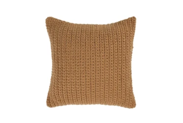

22X22 Amber Yellow Performance Solid Knit Indoor Outdoor Throw Pillow
$75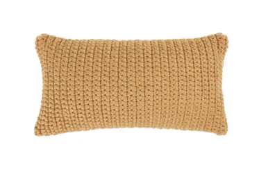
14X26 Amber Yellow Oversized Performance Solid Knit Indoor Outdoor Lumbar Throw Pillow
$69
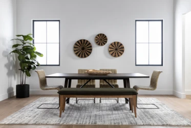
Pantone 2021 Decorating Essential: Ultimate Grey Rug
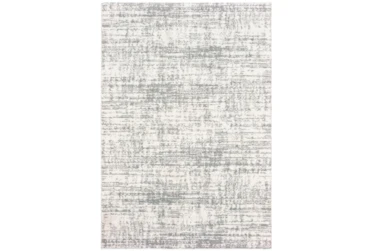
7'8"x10'8" Rug-Distressed Soft Shag Ivory/Grey
$595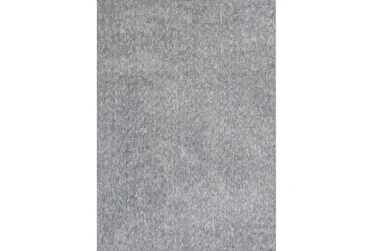
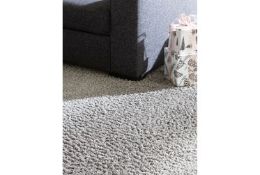
7'5"x9'5" Rug-Elation Shag Heather Grey
$650
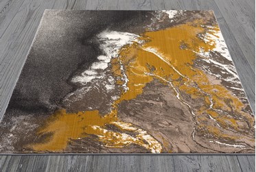
7'8"x10'5" Rug-Modern Galaxy Swirl Citronella
$650
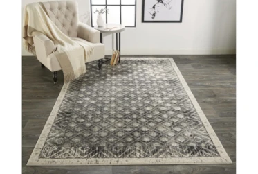
7'8"x11' Rug-Alexander Traditional Grey/Charcoal
$450
Pantone 2021 Decorating Essential: Illuminating Throw Blankets
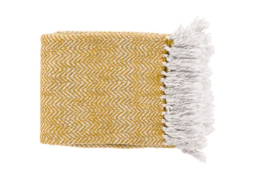
Accent Throw-Fiona Gold
$58
Pantone 2021 Decorating Essential: Ultimate Grey Wall Decor
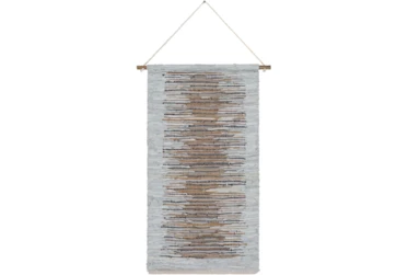
Wall Tapestry-Woven Leather Brown Grey 22X44
$63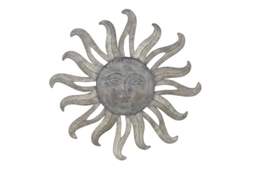
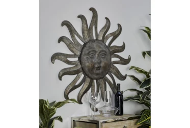
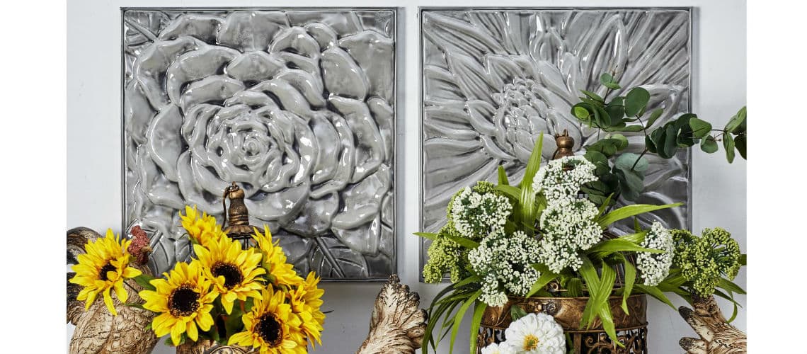
Grey 36 Inch Metal Wall Art
$94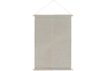
Wall Tapestry-Embroidered Grey 24X36
$69What Is Pantone?
Every year, a company called Pantone announces a new Color of the Year, and every year, waves are made that ripple across industries – each industry abuzz with Pantone’s chosen color. As part of the hype, social media trends tend to surge for keywords revolving around the color, and speculation and excitement begin even before the Pantone announcement. Like it or not, Pantone makes a splash in many visual markets (like fashion and interior design); and it’s a splash you can’t ignore, even if you tried.
With all eyeballs on Color of the Year, though, confusion often hangs in the air: What exactly is Pantone, anyway? And why is there a color of the year?
Pantone is a color-matching company. It’s purpose is to create a universal system of colors, where each color has a name and code, and each name and code is always associated with the same exact hue, every time. This form of color-coding ensures that when businesses and consumers talk about colors, they’re talking about the same color, the same shade. Consumers will never buy a product – and then end up complaining that that’s not the certain shade of yellow they specified. Pantone is a form of clear communication; it’s a needed system, and one that’s kept Pantone as respected within industries as it is today.
Why Is There a Color of the Year?
Pantone’s Color of the Year is the output of the Pantone Color Institute, a team of color experts devoted to choosing a color for the new year. According to their website, this team looks at trends in places like “fashion, all areas of design, popular travel destinations, as well as new lifestyles, playstyles, and socio-economic conditions.” In other words, the Color of the Year is intended to be a sort of “snapshot” of current affairs, or a way to symbolize a collective mood.
— Pantone-Inspired Reads —
Pantone-Style Decor
Read the Latest
Editorial Disclaimer: Articles featuring tips and advice are intended for educational purposes and only as general recommendations. Always practice personal discretion when using and caring for furniture, decor and related items.
